
Shopify Brand Color Setup — Store Styling Guide
When you start styling a Shopify store, remember: brand colors first, details later. Obsess over details from day one and you'll exhaust yourself. What counts as the big framework?
1. Global colors; 2. Global fonts; 3. Logo design
You should already have a feel for these from your user research.
Shopify brand colors
Define your primary, secondary and accent colors. Keep it to three or fewer for simplicity and consistency. If you want to get fancy, the background color counts as one more — most stores default to white.
Check your palette against this list:
- Primary brand color: used in most major surfaces; it's what makes people remember you instantly. Shopify is green, Facebook is blue — I say it, you see it. That's a brand color.
- Secondary color: buttons, borders — visual differentiation.
- Accent color: bold text, warnings.
- Background color: usually white by default; if you're going artistic, adjust it according to user expectations.
Can't nail the palette yourself? These two sites offer ready-made schemes — click to browse:
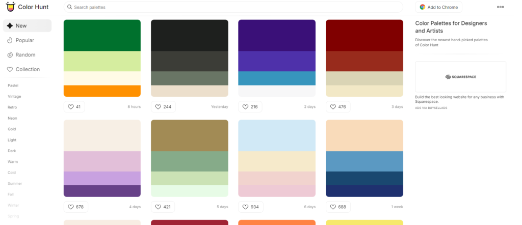
colorhunt.co palette site
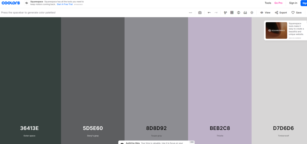
coolors.co palette site
For consistency, enter exact HEX codes (e.g. #FF5733) instead of eyeballing the picker — and record every code in your store-building document.
Many Shopify apps can't share the store's color system, so you'll re-enter these codes inside apps constantly. Writing them down saves you when memory fails.
Finally, preview the colors live in Shopify and make sure all the elements work together. Adjust as needed.
Where to configure
In the default Dawn theme:
- From the Shopify admin sidebar, open Sales channels → Online store → Themes.
- On the current theme, click Customize to enter the editor.
- In the editor's left sidebar, open Settings, then click Colors to see the global scheme.
- Edits preview live in the center pane.
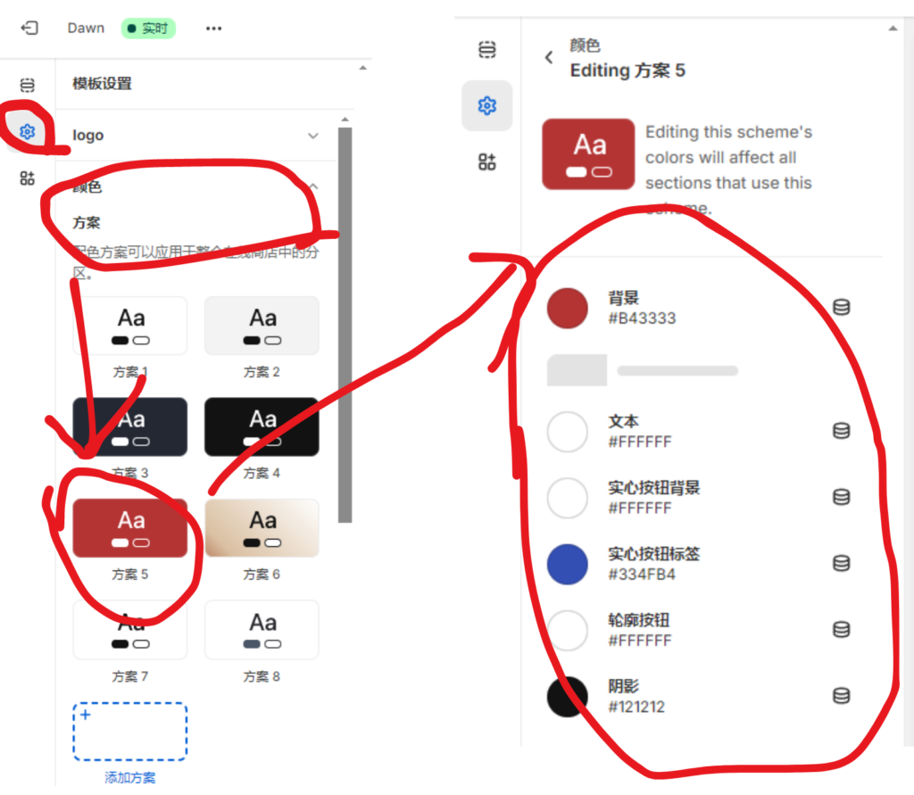
Editing global colors in Shopify's default theme