
Shopify Font Settings: Theme Fonts, Custom Fonts and Performance
If you haven't configured your global colors yet, set the brand colors first. Global fonts are part of the brand too — keep both in mind during research.
Shopify global fonts
A calligraphy lover's blog might use Song or another calligraphic typeface to express taste. A Mac devotee tends to use Apple's system fonts out of habit.
Websites work the same way. If your audience loves cute pets, rounded, adorable typefaces win — look at pet sites: mostly big, chunky rounded fonts.
Number of fonts: one family is usually enough for headings and body. Add a second only for a clear brand reason. “Two” is a complexity-control guideline, not a Shopify platform limit.
Font size: body text commonly starts around 16px for readability, while headings use responsive sizes to establish hierarchy. Do not optimize only for a desktop H1 value; check mobile wrapping, line height, button labels and usability at 200% zoom.
Choosing fonts:
- Audience preference. Match the typeface to your brand style — modern, traditional, minimal, luxury.
- Load speed matters.
- Shopify built-in fonts: cover common needs and load fast.
- Theme font choices: start with fonts offered by the current theme editor to reduce extra code and maintenance. The exact list varies by theme.
- Custom fonts: load a specific brand family through theme code or a trusted implementation only after confirming a web-commercial license. Too many files, weights or character subsets add download cost; the risk comes from resource size and loading behavior, not from the label “custom font” itself.
If you're set on a custom font, the download sites below have huge catalogs — some paid, most free. Use with care.
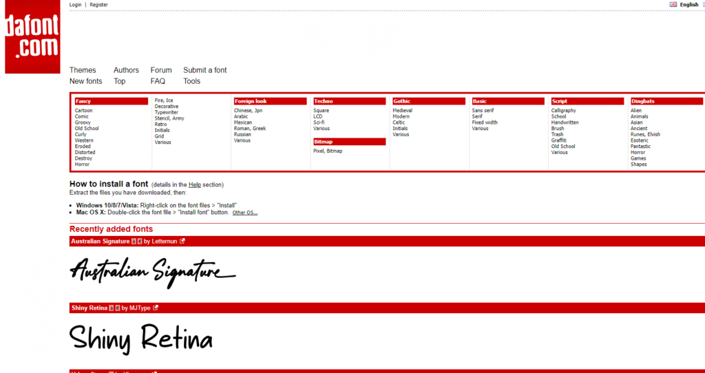
DAFONT, a custom font download site
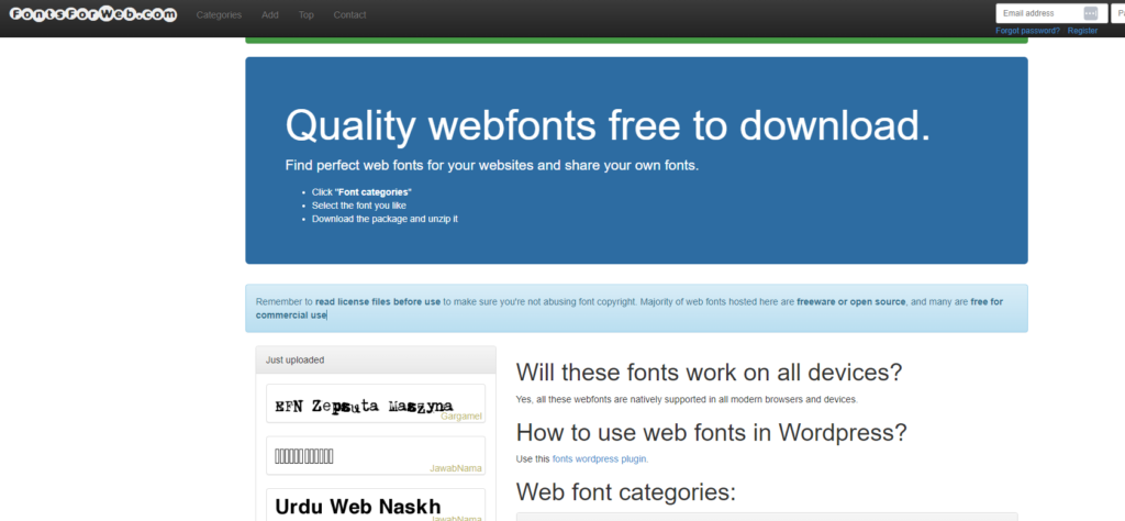
fontsforweb, another font download site
Where to configure
In Shopify admin, use Online Store → Themes → Customize → Theme settings → Typography. Labels can vary with theme and locale. Duplicate the theme before code changes so rollback is straightforward. Embedded app components can have separate typography controls; align them with the store system where possible.
Custom-font launch checklist
- Confirm the license covers websites, ads, email and expected traffic; “free for personal use” is not a commercial license.
- Prefer WOFF2 and keep only the weights and character subsets actually used.
- Define a system-font fallback so content remains readable when the web font fails.
- Use an appropriate
font-displaystrategy so text is not invisible for a long period. - Do not preload every weight, italic and language file; reserve preload for a font truly required above the fold.
- Compare first view, layout shift and mobile-network performance before and after loading the font.
Readability and conversion checks
- body line height commonly needs roughly 1.5, and long-form lines should not be excessively wide;
- buttons, prices, validation errors and labels should not rely on thin weight or color alone;
- test missing-glyph fallback, punctuation and numeral widths in every supported language;
- product titles should not occupy excessive mobile lines because the chosen family is too wide;
- test a real product page, cart and pre-checkout journey, not only the homepage preview.
Typography should improve reading, consistency and stable loading. If a custom face adds no meaningful recognition, the theme's built-in choices are often the lower-cost decision.